Project Overview
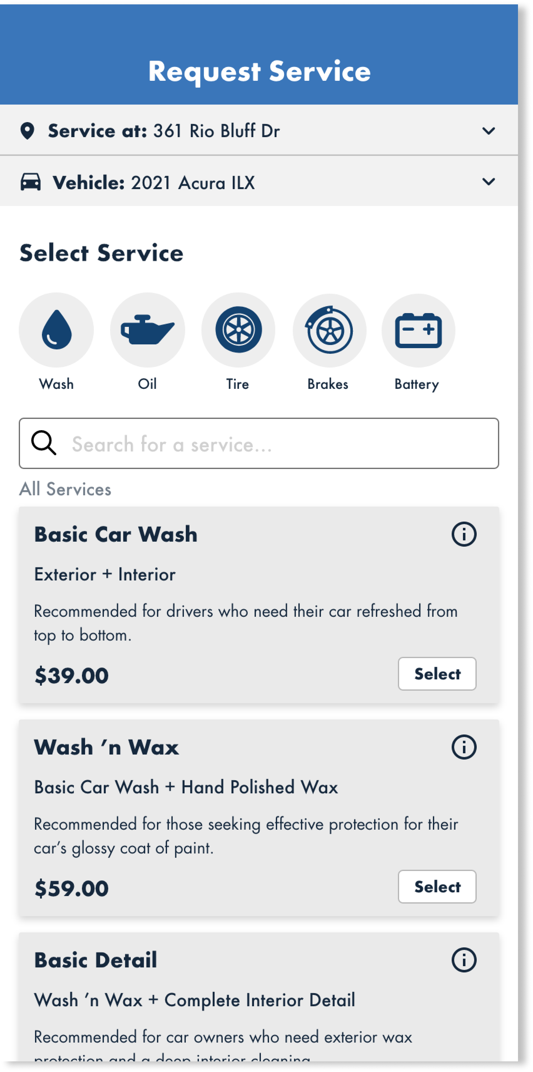
This project's focus was to redesign a fast growing car care company’s mobile app. Although the application featured several main pages including customer service chat, upcoming appointments, a garage to view owned vehicles, and settings, I decided to focus on the app’s main purpose - the booking flow.
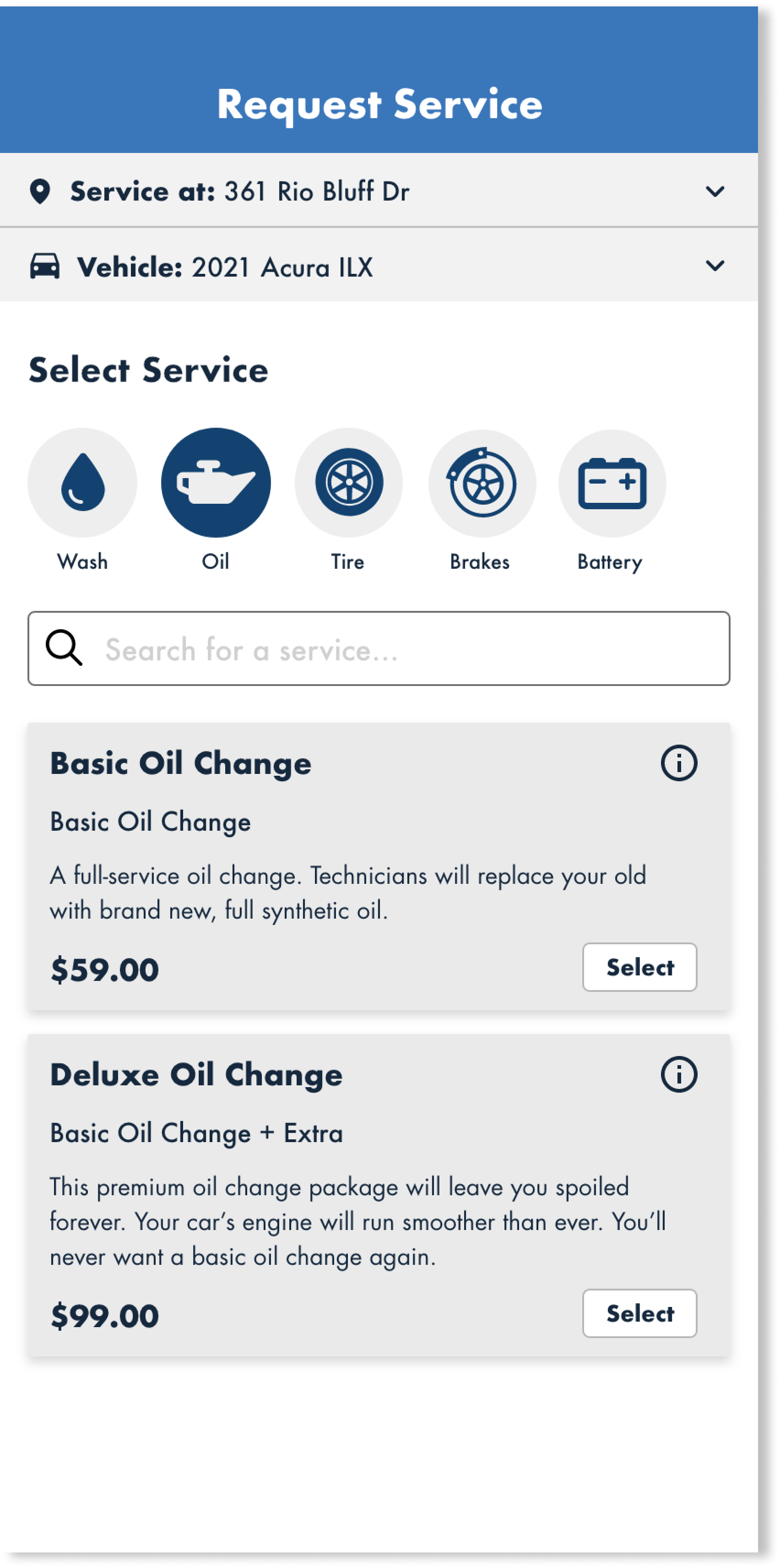
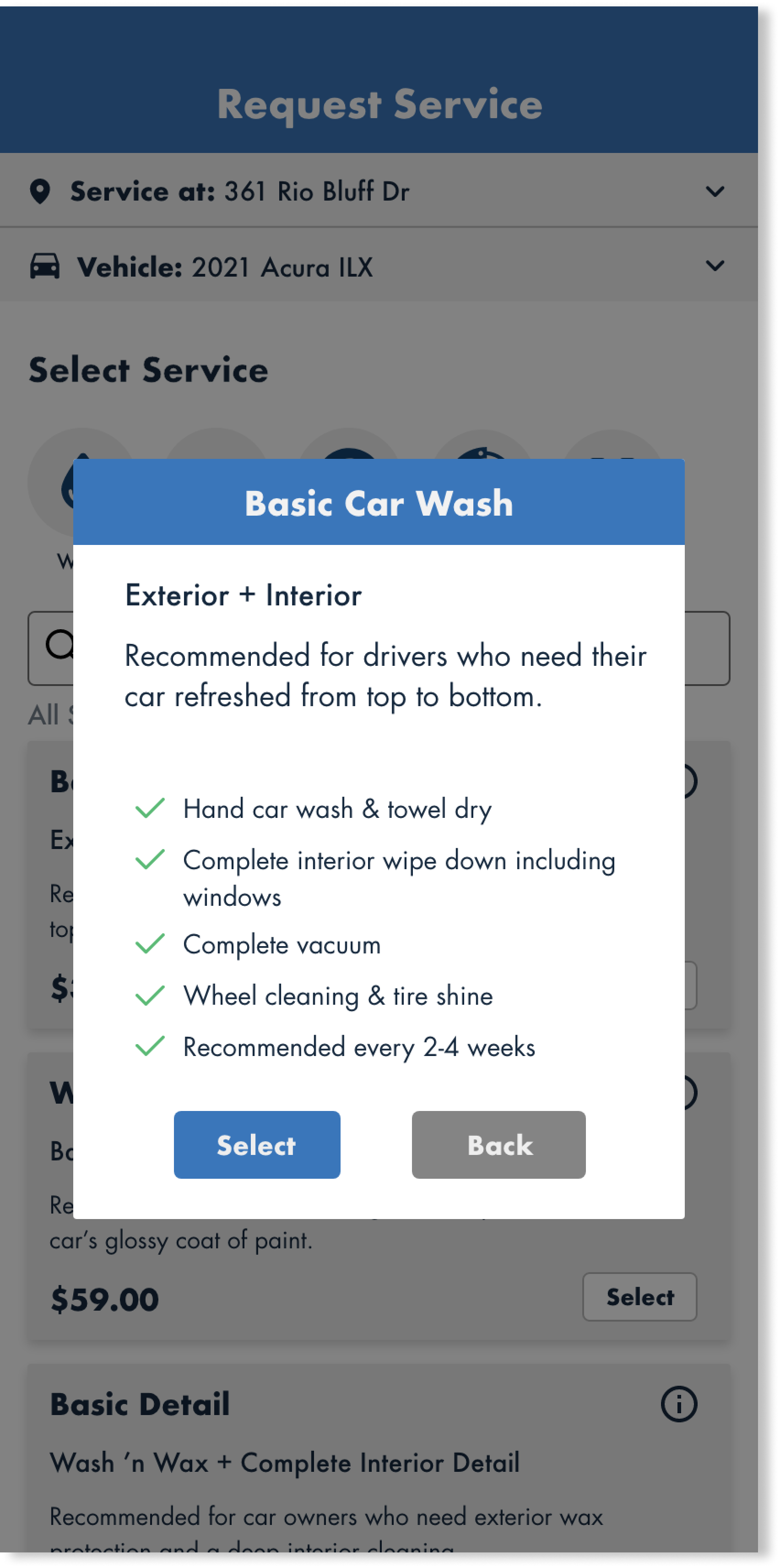
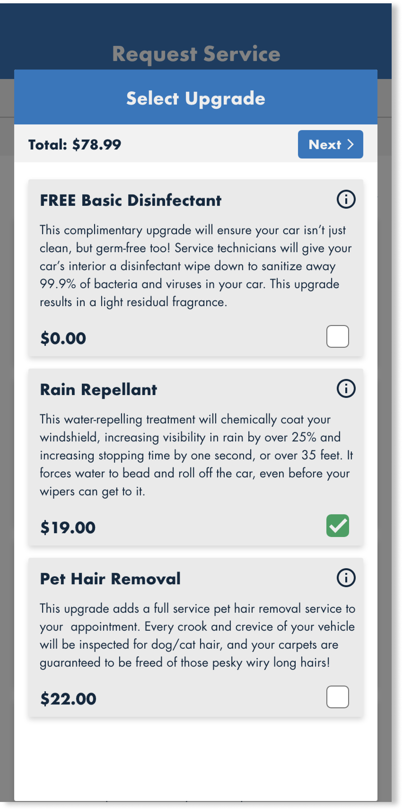
My main goals were to both modernize and clean up the visual appearance. The predominant border radius and big cartoonish images gave the entire app a tacky feel, and I envisioned the tone to be more professional and trustworthy. I also both styled and rearranged content to mimic the feel of ecommerce applications to help end users feel more at home in this digital, online-ordering era.
Technologies: Adobe XD, FigJam
Team: Solo
Timeframe: 4 weeks
Original Design
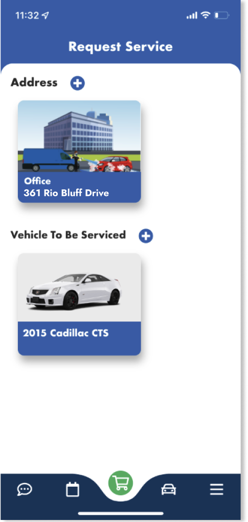
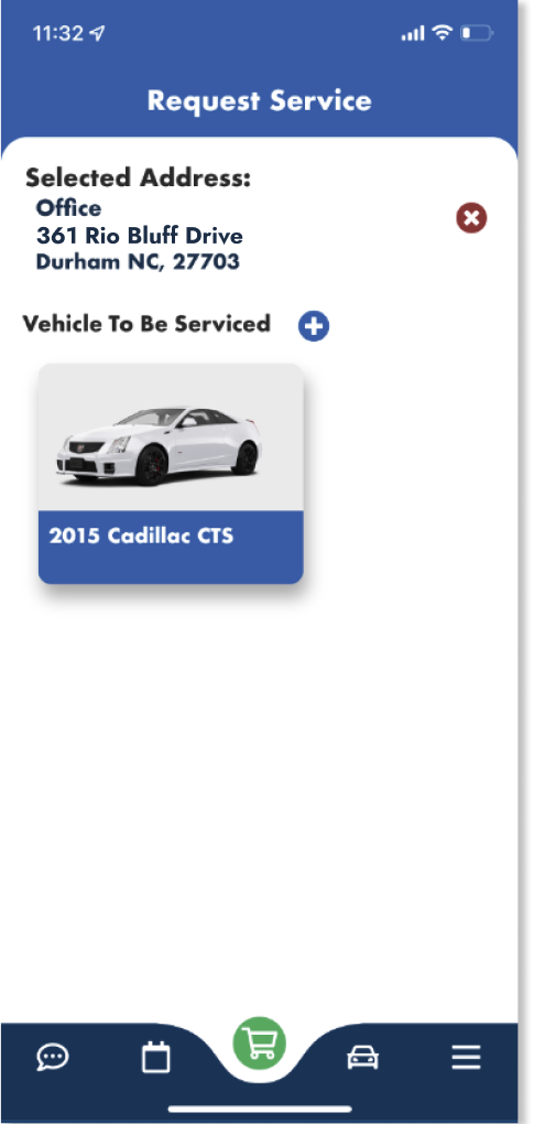
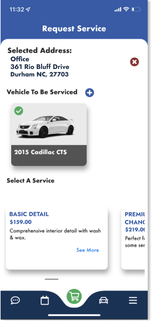
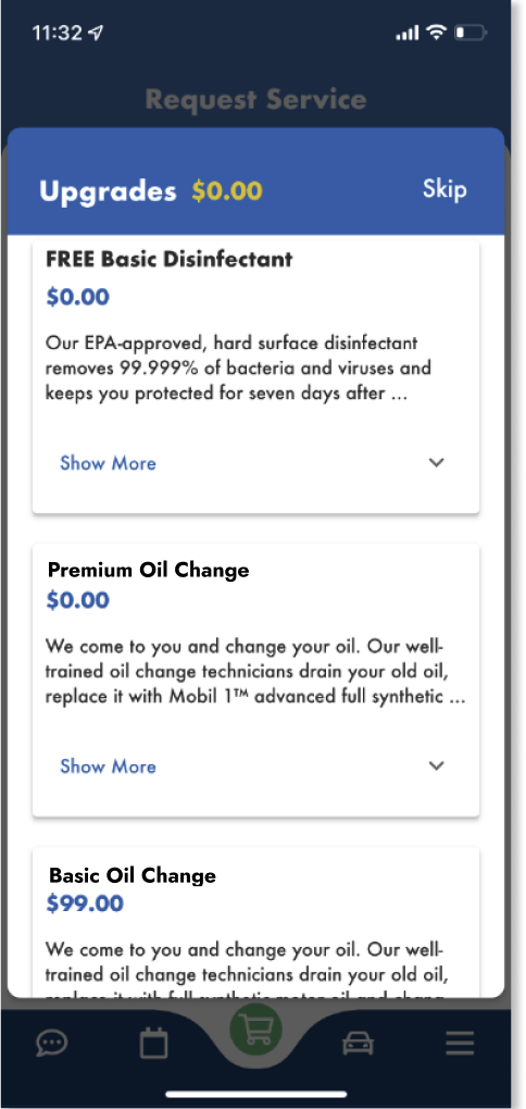
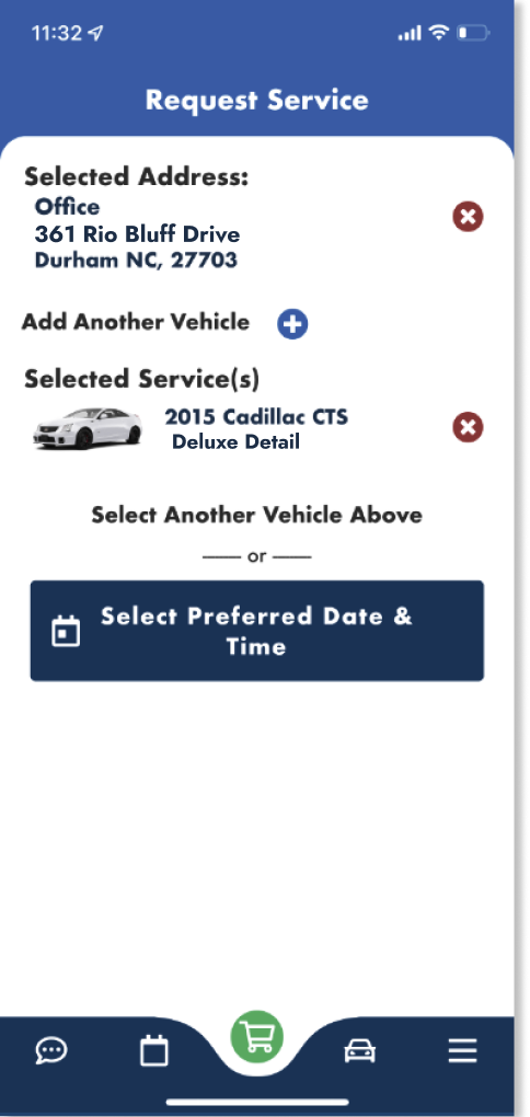
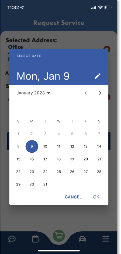


This was the original appearance of the app at the time that I began this project. I began by marking up each of these screenshots in FigJam and writing in stickies on the side what I thought felt off about each piece of each screen*. The recurring theme I found was improper hierarchy. On nearly every step throughout the booking process, I spotted the main focuses being overshadowed by large images and sweeping use of bold typography. The secondary points of interest often took up much more space than necessary.
*I opted to skip the date-picker and time-picker pages as those were mostly prebaked widgets that functioned how most users would expect them to.
Marking Up the Current Design
Inspiration
I aimed to leverage users' familiarity with leading online retail platforms like Amazon and DoorDash to create a seamless booking process. Additionally, I noted the way different brands allocated space appropriately according to information hierarchy.
I noticed that particularly in the Amazon app, while card components remained a prominent element when browsing products, they retained a modern feel. It also continually displayed the address at the top of the shopping page for users to review and revise it without occupying too much space. Meanwhile, DoorDash smoothly handled its large range of options by implementing categories at the top of the initial shopping page, rather than forcing users to scroll endlessly through choices.
Both apps shared a common thread - a clean, uncluttered aesthetic that adhered to patterns. I realized that too many splashes of color or deviation from simple grid-based layouts would distract from the core experience of the app.
Redesigned Booking Flow
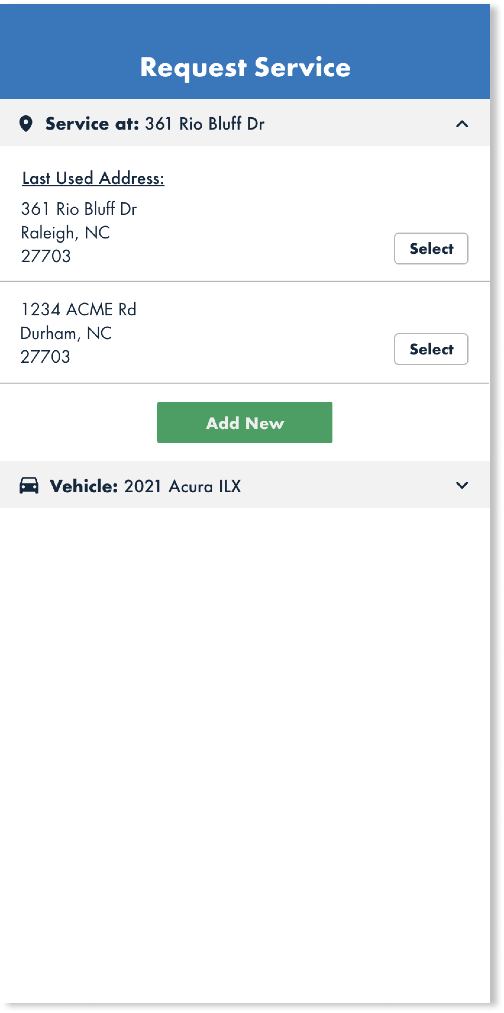
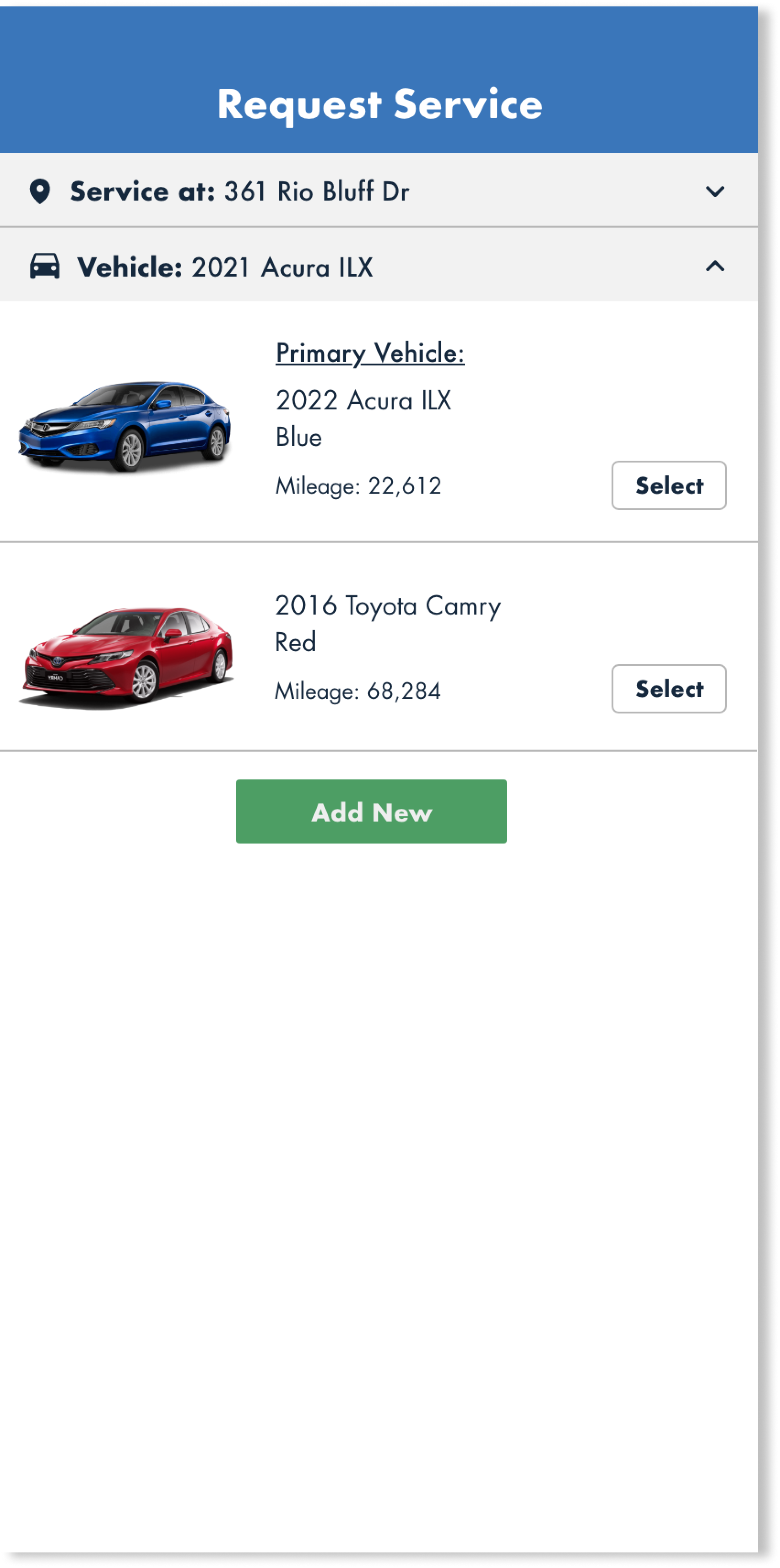
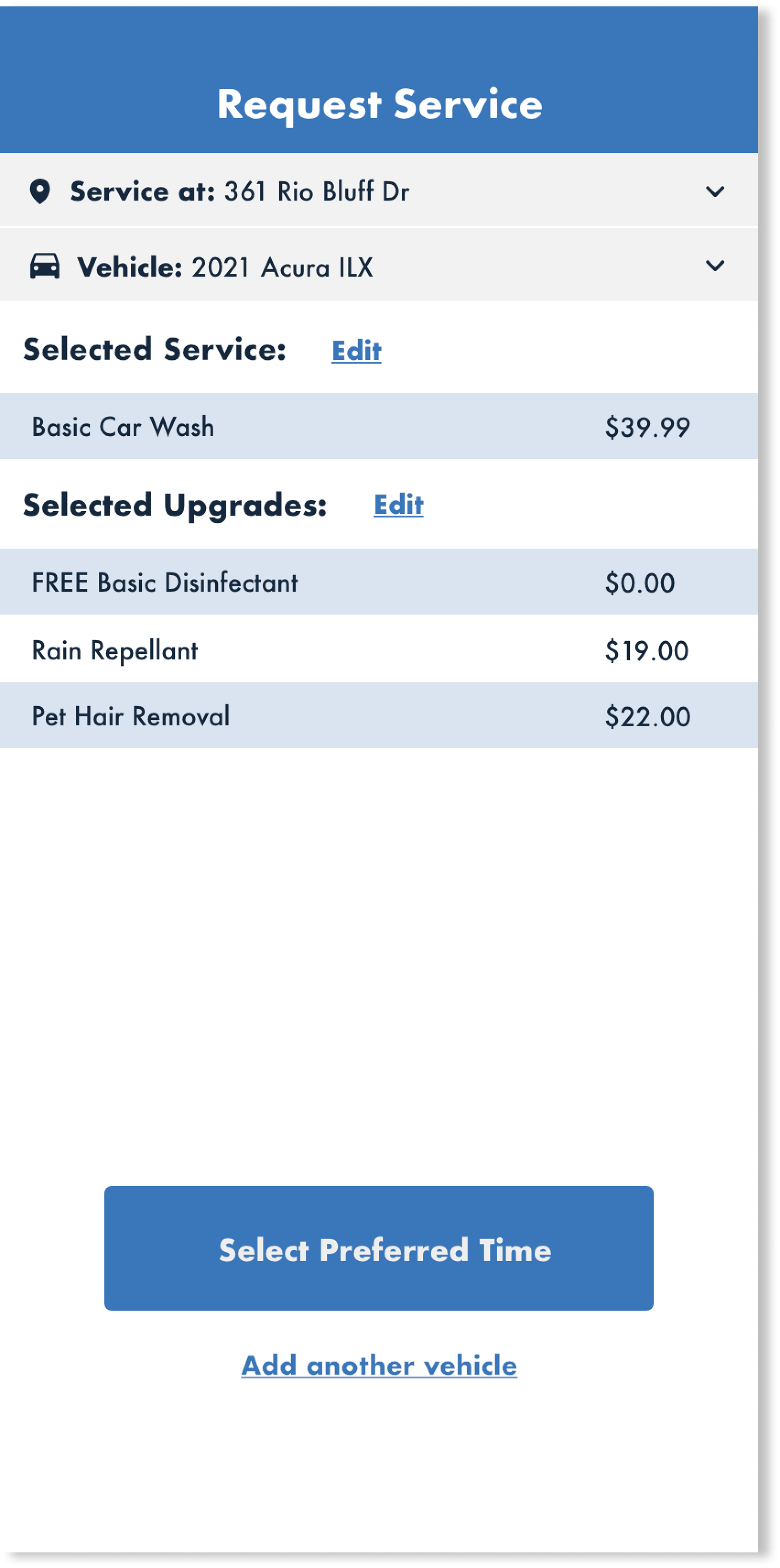
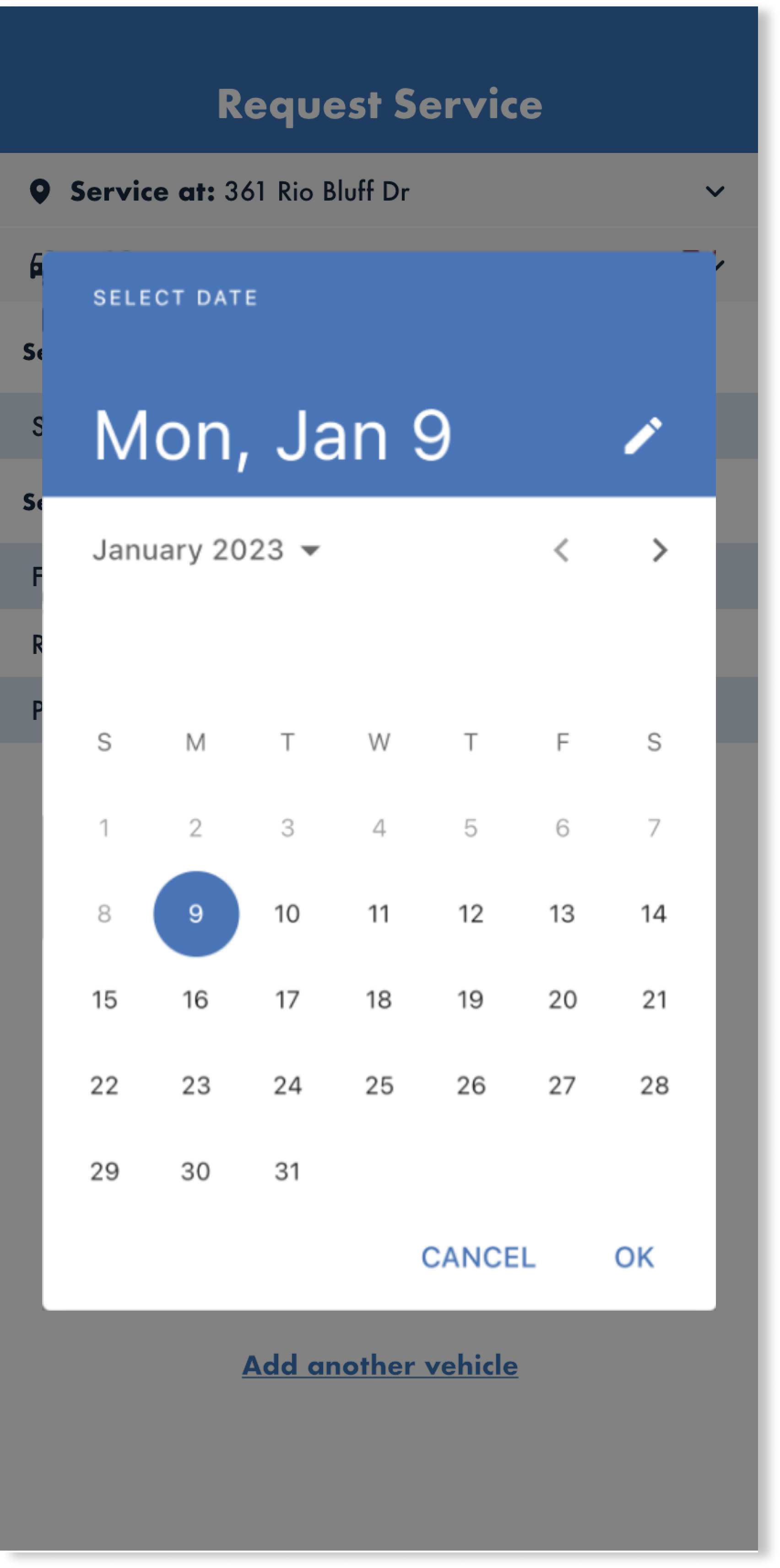
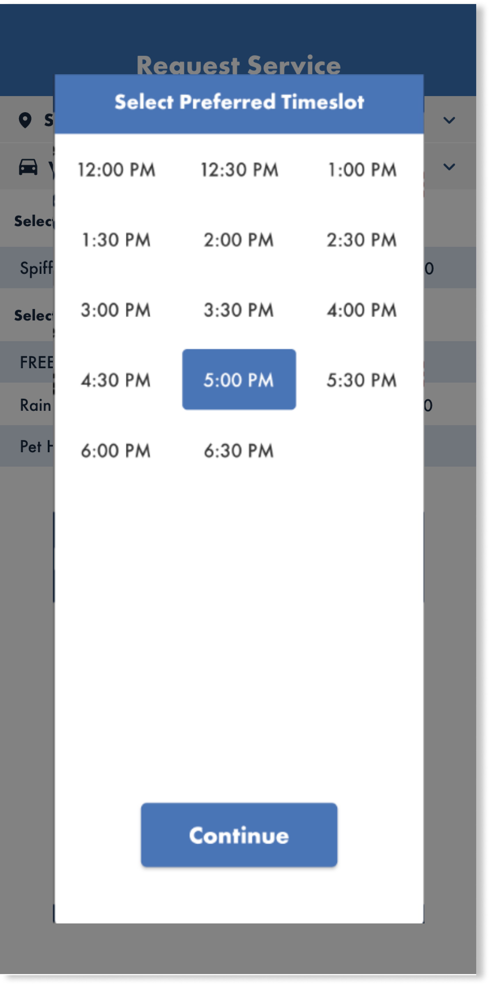
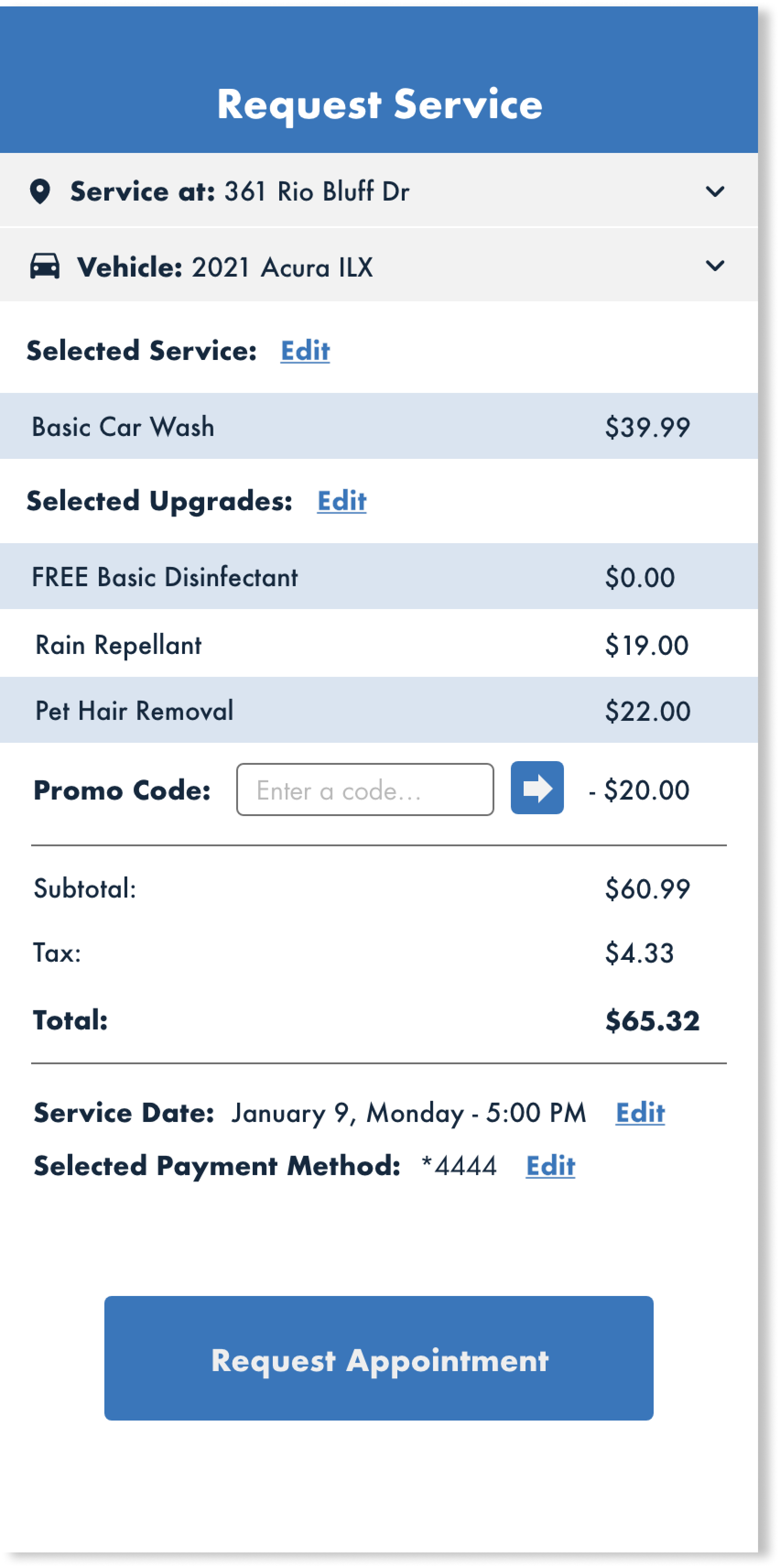
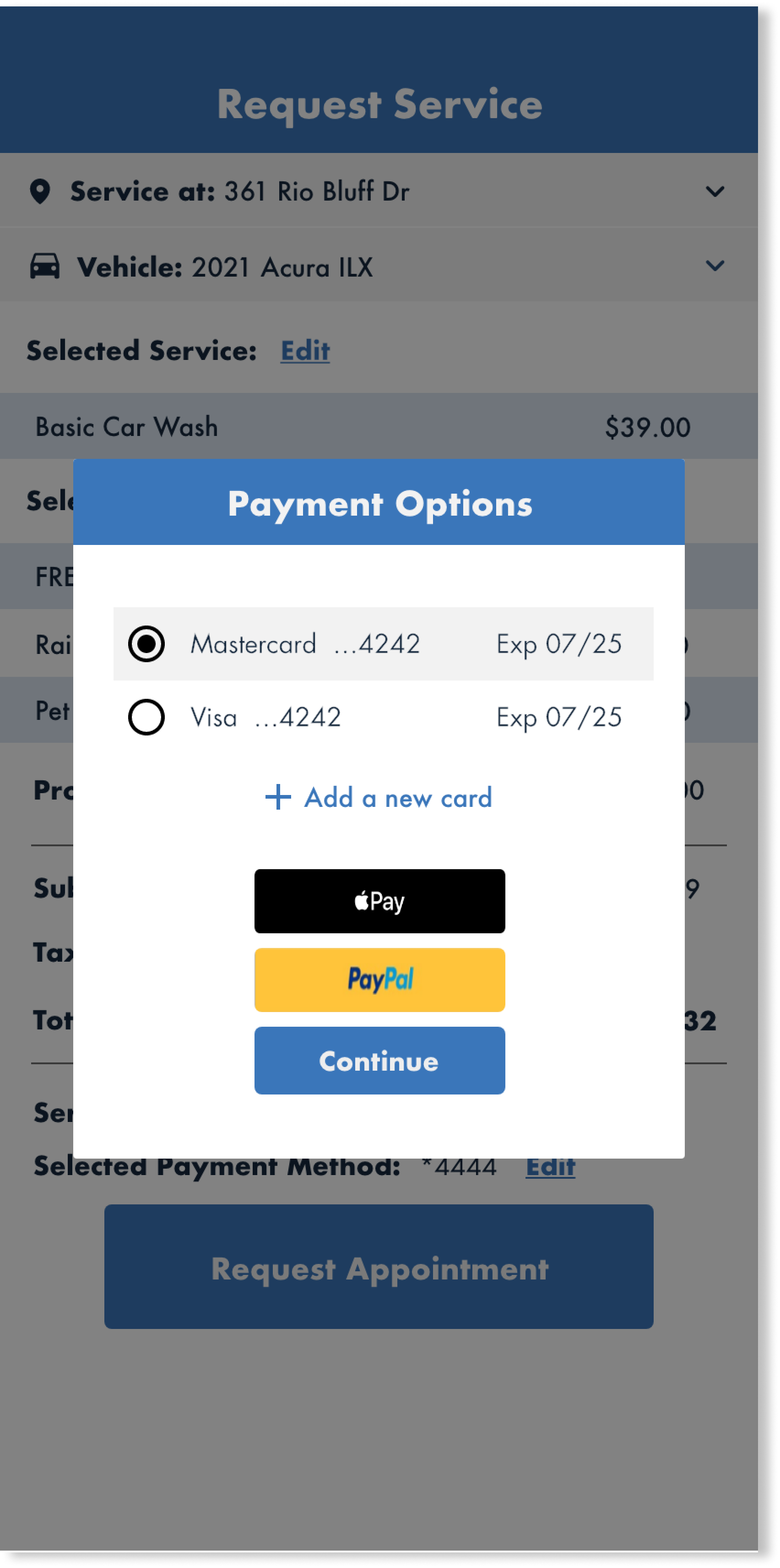
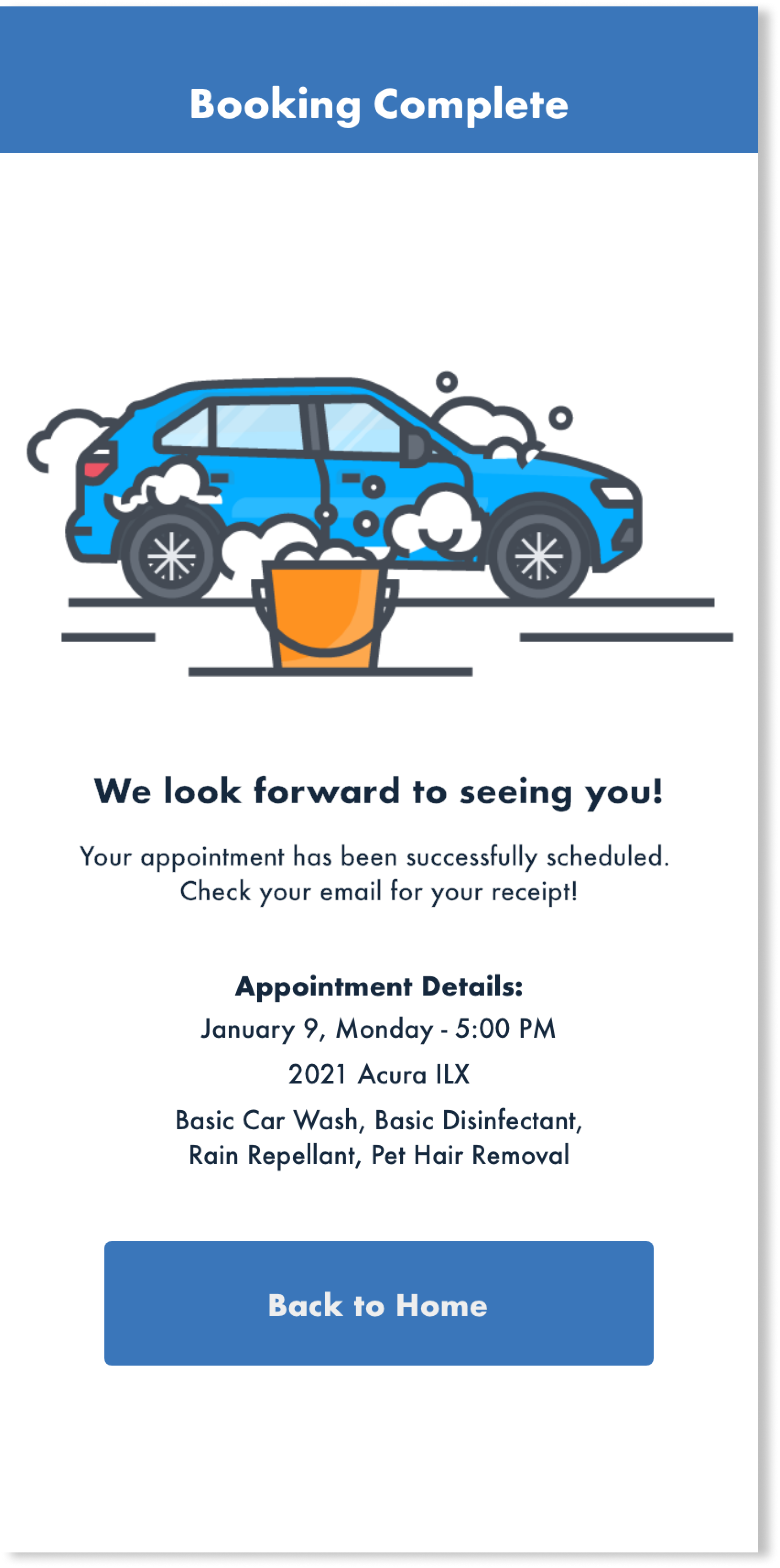
Disclaimer: All designs featured on this page have been obtained with proper authorization and in compliance with all applicable laws regarding intellectual property rights.