Project Overview
In this project, my task was to design an experience for an mobile car care company's internal software that was both visually appealing and easy to use. Having not worked on such an information dense product before, I found this project presented unique challenges for me to navigate.
I wanted to prioritize the usability of this product over anything else. As this was a software that some users looked at for eight hours every weekday, I didn't want to exhaust their eyes with bright colors or animations. I felt this would detract from the visual hierarchy that was so important in this tool to make features and information more accessible than in any previous iterations of the software.
Technologies: Figma
Team: Solo
Timeframe: 6 weeks
Doing the Research
Before I could begin prototyping, I needed to identify the users' needs. I began by interviewing employees about their thoughts on their current layout of their internal software, and what potential changes would improve their workflows. Since I wanted to focus most on how the content should be organized, I separated out comments about visual appeal. Any remarks about "ugly" buttons, colors, font choice, and the general "prettiness" of the application were set aside for the time being.
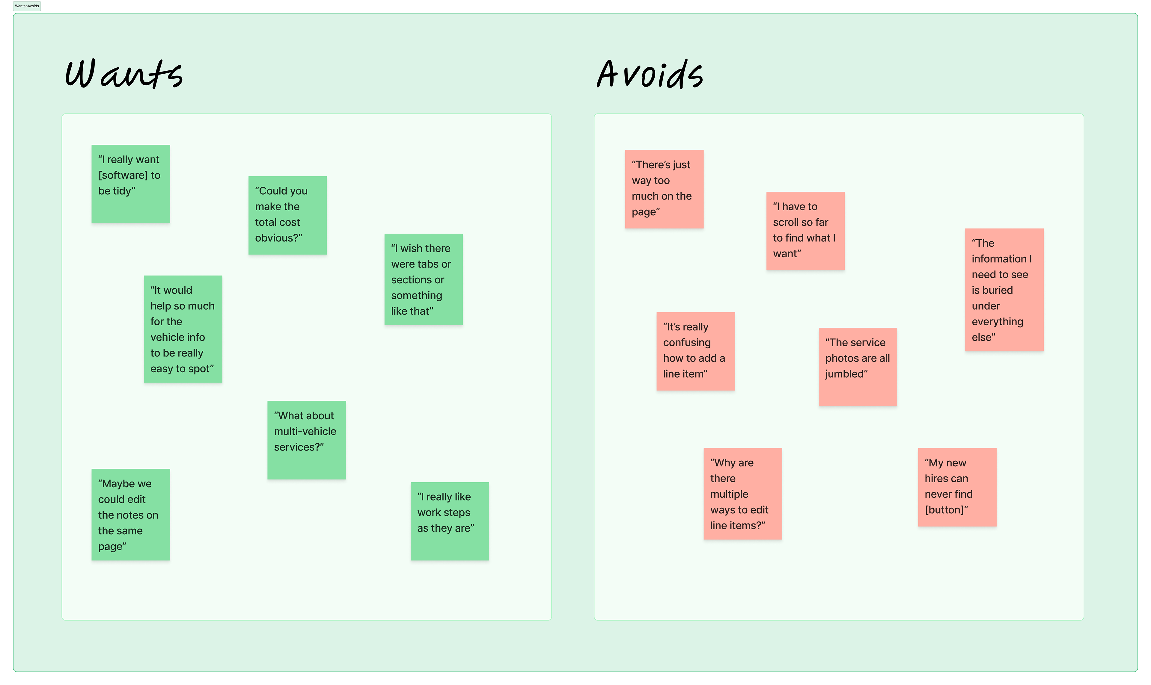
I noticed a trend where many current users complained that the features they used frequently in their day-to-day work were often the most difficult to access. This was a difficult problem to tackle since many different departments were using the same software. I started reviewing user data to guide my efforts to organize the information according to how often each feature was used.
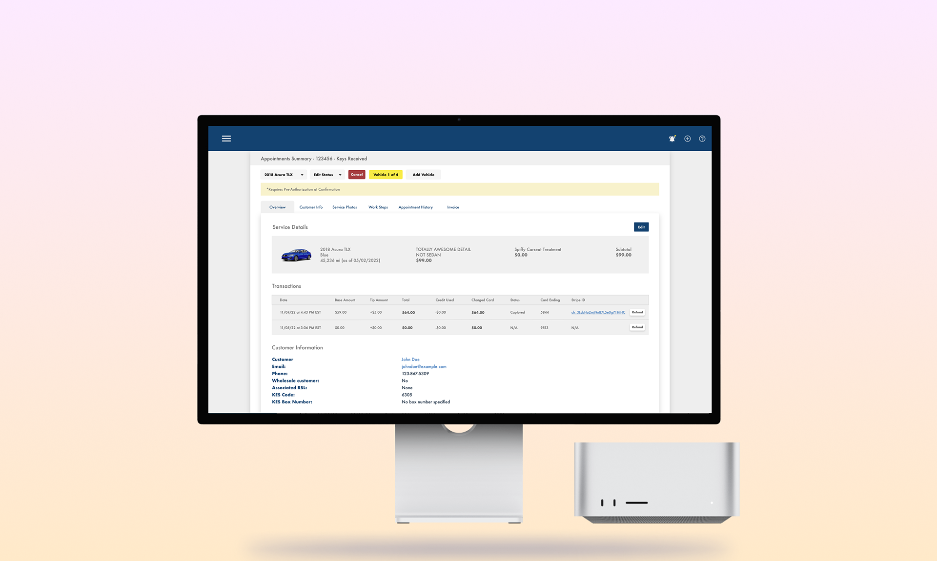
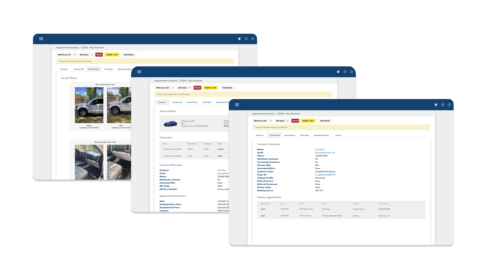
The Results
Takeaways
This project was a blast to work on and taught me a lot about how to create products that put the user first. In the past, I have only worked on applications that were very self contained - An app to order a certain product, or software with a specific type of user. In each project, the user flows had a lot more clear start points and end points.
Designing this internal application was my first time working on a product that was used by such a diverse set of users, all day, every day. There is no real final "end point" for the people using this software to reschedule appointments, chat with customers, and look up zip codes for services. The information must be within a few clicks no matter where they are in their workday.
Due to the massive amount of information contained in this software, it was a unique and fun challenge having to set aside my perfectionist desires for a "pretty" app in favor of emphasizing the usability on such a large scale.
My final product is not flashy or pretty. But it's usable. It makes people's work a little faster, a little easier, a little less tedious. And ultimately, I'm really proud of the way I was able to improve people's work every day.
Disclaimer: All designs featured on this page have been obtained with proper authorization and in compliance with all applicable laws regarding intellectual property rights.